genres
De Amsterdamse Krulletter
€31,00
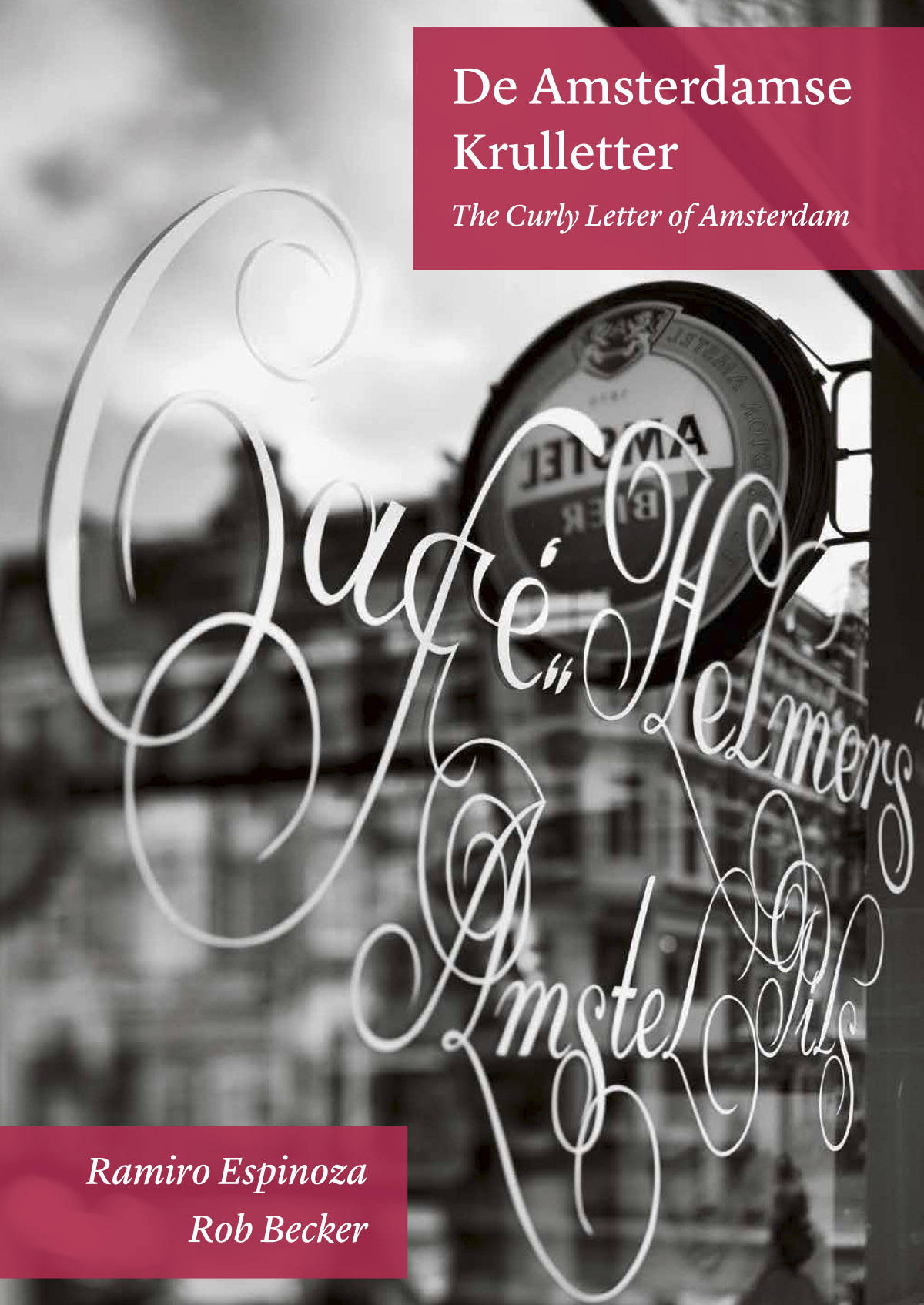
What are the origins of the exurberant swash letters that can be found on the windows of Amsterdam’s most traditional bars?
Author(s): Ramiro Espinoza en Rob Becker
Language: Dutch - English
Pages: 212
Size: 170 x 240 mm
Edition: Hardcover
ISBN: 978-94-6226-117-4
Year: 2015
Photography: Rob Becker
Publisher: Lecturis
Design: Ramiro Espinoza
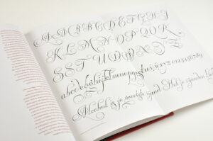
What are the origins of the curly letters that can so often be found adorning café windows across the city of Amsterdam? Who painted them? How old is the style and where were they designed? Do the letters represent an expression of the Amsterdam graphic tradition? And what are the links to calligraphists from the Dutch Golden Age? The Amsterdam curly script delves into this Dutch tradition of letter design, which was overlooked until very recently. Over a period of seven years, letter designer Ramiro Espinoza interviewed letter painters and their families, researched photo collections in the Stadsarchief Amsterdam and gathered evidence in order to provide answers to the most important questions relating to this relatively unknown area of Dutch popular graphic culture, and to stimulate awareness about its cultural relevance.
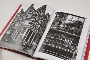
In beautiful black and white, photographer Rob Becker documented all existing windows in Amsterdam, Maastricht and Gent in order to capture the ambience and context in which the curly script flourished. His photos form not only a report of the topic in general, but they also form a true artistic homage to the Amsterdam ‘brown’ cafés.
Additional information
| Weight | 684 g |
|---|


